THEORY OF GOOD AND BAD CHARACTER DESIGN
- Jonathan Whittingham

- May 17, 2020
- 4 min read
Updated: May 21, 2020
Clarity

Good design should involve three key elements, clarity of silhouette, clarity of palette and clarity of exaggeration. These are some vital elements that can make or break a character design. When these are structured well the character can be recognisable in any art style.
What is Bad Character Design?
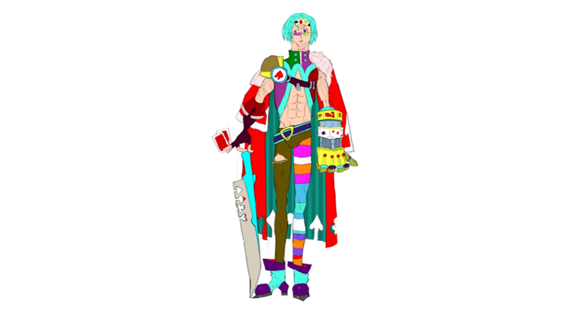
The artists from BAM, created a bad character design on purpose by using a messy silhouette, a confusing colour palette and a generic body type and clothing. They also added lots of detail which will make it a nightmare to redraw and in a professional context, if this design was to be sent to an animator it would be easily rejected. It also has a lot of tangents, this is where the subjects in the background and foreground mix, this gives the design a lack of 3D space and it falls flat.
Silhouette
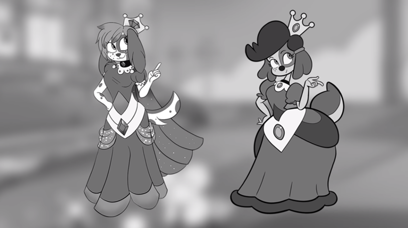
The character on the left was submitted to them and it is a very good design, but it could be pushed further by changing the silhouette.

As you can see the silhouette on the left is not as clear as the silhouette on the right. To make it more clear, the neck has been extended, the hat is smaller, the arm has been extended and the tail has shrunk. These small changes enhance the silhouette and make it a lot more readable to the audience.

Shape
The original character also has a lot of conflicting shapes that are going in, so if the shape language is changed to triangles, this helps portray the message that the character is trying to give off.

When this is done properly it can boost the look and originality of the character. In this example you can see that pushing the shapes makes her come across as a dangerous femme fatale and a force to be reckoned with.

Palette
For creating a palette, don't use to many colours, be selective. Choose a hierarchy, where one colour is the dominant one and the other colours are used to support it.
With this submission from a fan the colours didn't work well together and when the artists reduced the saturation, they realised that the values were too similar which causes the artwork to merge together.

When the lineart is taken away you can see that the colours blend too much, since blue and turquoise are cool colours and are very similar, it's hard to tell where the character's ear ends and where the shoulder of the dress starts. Another way to help find the right values is to paint the character on a midtone background, painting on a white page will cause you to make areas of the design either too dark or too light.

The artists then redrew the character and put more emphasis on the saturation levels, keeping a nice balance around the shape. I also notice that the overall shape language is more circular whereas before there were no defining shapes making it look generic and flat. Weight of the line has also been enhanced to make it stand out more and there are thinner lines used in the details of the face and clothing.
In terms of colour the hues were not too much different to the original, however the use of changing the values really elevates the overall character design. There is a lot less going on in the second image but this simplicity really enhances the character, with the image on the right there is too much going on causing the colours to clash.

Exaggeration
Exaggerating parts of a character can really make the character more unique and easier to recognise. In anime a lot of designs look the same and they come across as generic. Artists have the ability to strip down the details, exaggerate proportions and boost the colour to convey a story.
"Designing characters with simple easy to read features, will allow us to see that character's emotion more easily. We have empathy for characters that we can project ourselves onto, and put ourselves into their shoes." (Pauson, 2020)
Pose is a form of exaggeration. Is the character masculine or feminine, introverted or extroverted, lazy or focused? The pose can enhance these characteristics of the design.
Body Variety
There are lots of different body types in the world and just sticking to generic body types does the art a disservice.
For this example below, the image on the left is good it has a nice story and sense of humour behind it but if the proportions are exaggerated then it adds to the story. The issue with the one on the left is that the characters are too close together so it's harder to tell who is in front and who is behind. However with the image on the right there are clear silhouettes if each character. With the image on the right the man is thinner and more uptight, where as the demon is bigger but more naive.
Even though the image on the right was done by a professional I still don't like some aspects of it, for example the background doesn't blend well with the characters and I also actually prefer the facial expression of the image on the left, it has a shock factor which makes it funnier in my opinion.
Comparing images like this helps me to understand my artistic voice more and helps me to be more critical about art and seeing where improvement can be made. This can be helpful when analysing my own work or giving advice to others about their work.


Reference:
Noll, B., Pauson, M. (2020) GOOD vs BAD Character Design: Tips and Tricks!. [Online Video]. 5 March 2020. Available at: https://www.youtube.com/watch?v=8wm9ti-gzLM&t=239s. [Accessed: 17 March 2020].


Comments