DEVELOPMENT "SAVITRI"
- Jonathan Whittingham

- Feb 26, 2020
- 1 min read
Updated: May 19, 2020

I started with the base image where I had the silhouette of the face and started to fill her with colour. I added gradients to some of the image such as her body, lips and headscarf to add more depth and variation. I then started to add part of the forest on her body. I used the pen tool to create the shape and then filled the shape with a gradient colour. I use the same colour as in her hair but made it go from a solid colour to transparent so it all blends together nicely.

I then added more layers to the forest, I felt it was important to add more layers to the image which would create more depth. I also stuck with colours that would go with the overall look. Afterwards I tried to add a gradient on Savitri's face but it did not look right, I felt like I was starting to over use the gradients so decided to remove it.
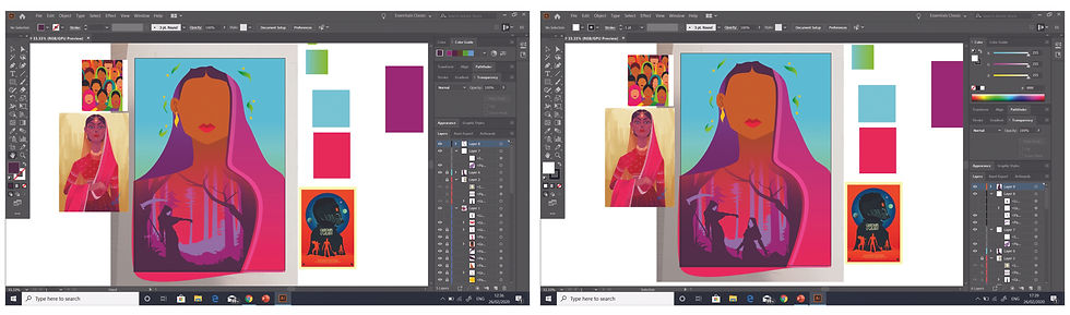
For the final parts I drew death using only simple outlines and the traditional scythe to make it easily recognisable. I then added silhouettes of Savitri protecting her husband. I wanted to show a bit of the story within the poster and thought the scene where Death tries to take the husband, would be a perfect fit for the poster.


Comments