DEVELOPMENT "AT THE BOAR'S HEAD"
- Jonathan Whittingham

- Feb 28, 2020
- 2 min read
Updated: May 19, 2020

For this design I decided to use Falstaff the main character as the main subject and the head of a boar in the background. I started filling the subjects with colours that I saw from various paintings of Falstaff and liked the combination of green, pink and red working together.
With the image on the right I lightened the beard and the background however the colour combination still doesn't work well.

I went back to the original colours and to see what it would look like with an outline, and it seems to bring out the face a bit more but doesn't work with the whole flat design look and feels out of place. I got rid of the outline and switched the colour of the boar with the colour of the background. The tones seemed to clash when I did this and I needed to try a different combination.

I went back to the green background but muted the tone and that seemed to help but it still didn't have the look I was going for. I then changed the hue to a more brighter green and I was starting to get somewhere. I then realised that the colours were distracting me too much and I needed to figure out the values, so I changed the image to black and white.

I tried out a different variations of black and white to see which one would work. What I did was add the colours I liked, then change the screen to black and white. I would then change the values if they looked off. I learnt that even though two colours can be opposite, they can still have the same value and blend in together too much, doing this helped me to figure out which values gave the best contrast.

Once I got the final colour scheme I just tried by inverting the colours of the red and green, however I prefer the one with the red outfit as the other one looks too much like Robin Hood.

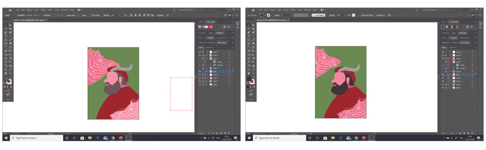


I added the boar back into the image and played with the position because it felt too much, having the boar right behind his face. I duplicated the boar and put one on the bottom right corner and the other in the top left corner. This seemed to give balance to the image. I shrank down the top left boar so that it wasn't touching the main subject. I offset the outlines from the shape inspired by Jonathan Lawes as he likes to offset shapes in his work. I think this gave my piece a more screenprint type look. I then cleaned up the lines on the boar outlines as some of the details were a bit off. Afterwards I made a few small changes to the beard colour and background.


Comments